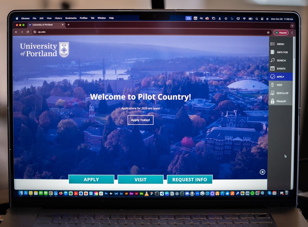
This past summer, the University of Portland made a substantial investment in redesigning its website by partnering with Carnegie Higher Education, a leading agency in marketing and enrollment. The redesign, UP’s first since 2016, aims to address the ongoing enrollment challenges and feedback from students and faculty who have long called for a more user-friendly platform.
The redesign process, primarily funded by donors, will incorporate feedback received from students during workshops held Oct. 22 and 23 and responses from an email survey sent to gather additional input. According to Vice President for Enrollment Management and Marketing, Mai Nhia Xiong-Chan, the website is expected to be under construction for the next 12 months.
The website will remain operating during the redesign process, with early-phase improvements and a "brand refresh" expected as soon as January.
According to Xiong-Chan, UP’s current website, with nearly 7,300 pages, is not functioning efficiently enough to meet the University's goals. Just 14 pages generated 60% of web traffic, highlighting the site's inefficiency.
“It doesn't provide the best user experience,” Xiong-Chan said. “It's not supporting our initiatives for enrollment, it's not being a great tool for marketing our institution, people can't find anything on it and people just don’t like the way it looks.”
Greg Pitter, UP’s chief information officer of information services, is playing a key role in the intranet side of the website’s reconstruction, which is the internal-facing part of the website that requires a login.
Pilots.up, a page that UP students visit daily, is the primary example. The updates will feature a faster login process and more direct access to essential resources, creating a more streamlined experience.
According to Pitter, the redesign will feature direct links to essential resources like the registrar’s office, financial aid, academic advisors, the career center and the Shepard Academic Resource Center, making them easily accessible for students without the need to search.
Additionally, the updated website will feature an increased emphasis on UP athletics, enhancing visibility of its Division I athletic programs to prospective students who enjoy a competitive atmosphere. Xiong-Chan explained that while UP Marketing and UP Athletics have maintained robust social presences separately, merging them on the new platform will be advantageous.
“They have been two giants sitting next to each other,” Xiong-Chan said. “And we're going to start holding hands. Which I think will enhance our ability to demonstrate to outsiders the ecosystem of athletic events available here.”
Overall, Katybeth Allen, UP’s manager of web and email, thinks the goal of the updated website is to ensure that UP’s digital presence reflects its on-campus experience.
“[UP] is such a supportive community of people where faculty and staff genuinely care about the students,” Allen said. “There should be a digital presence and brand presence that matches that.”
Xiong-Chan is confident that the redesign and brand refresh will help tell UP’s story in fresh and compelling ways.
“The website continues to be the single most important and largest marketing tool the University has at its disposal, so we need to make sure that it’s optimized,” Xiong-Chan said.
Taylor Helle is a News Reporter for The Beacon. She can be reached at helle25@up.edu.


