Due to the pandemic, I have been washing my hands a lot more than normal in the last year. This is usually a pleasant experience in that it is completely forgetful, with no lingering reminder of the act, save the light scent of hand soap. Sometimes, though, there are hand-washes that linger for all the wrong reasons, washing experiences that irk me and leave me wishing that I had not washed them in the first place. This happens more often than it would seem.
Let us quickly define a sink. For the purposes of this article, the sink consists of two parts: the faucet and the basin. These two components fulfill noble jobs, as their entire existence revolves around dispensing water for you to cleanse your hands in and collecting it when you are finished. The rest of this system and its functionality is left as an exercise for the reader.
Jokes aside, this is a system that is as simple as it is nuanced. I cannot stress the importance of the following statement enough: faucets should be paired to basins and form should always follow function with no exceptions.
The eagle-eyed among you might have noticed that there is an order of operation to that sentence. The basin is chosen first and the faucet is chosen to complement the basin. Never the other way around. As you can see, this is not a complicated set of rules. In fact, there are two. However, this formula is so often busted in practice, it makes me wonder if there is any forethought put into the selection of components, or if the “good” sinks just happen by accident.
“Okay, so what makes a good sink then?” Thank goodness you asked. Basins should be wide enough to catch any splashes from the act of washing hands and should also be an appropriate size for the space at hand. Geometric shape is of little concern so long as the “intake area” (the plane formed by the top of the basin) is wide enough to fulfill the aforementioned requirements. Should the need be, width may be sacrificed for either more length or more depth but never the other way around. Length (distance from the front of the basin to the back) should be held in higher regard than the width of the basin. Finally, the basin should be of adequate depth so that splashing water does not escape the basin.
Now for choosing the faucet. The way in which the water exits the faucet should be a secondary priority. Location of water exit (i.e. where water comes out of the faucet) should be held paramount. Remember, not everyone has a standard size set of mitts. A safe rule of thumb is to have the faucet dispense water directly in the geometric center of the sink. This, however, should be used only as a general rule. Make no mistake, every size hand should be able to use this basin/faucet combo with no issues, including not touching any part of the basin when trying to rinse. Touching the basin like that is unsanitary, uncomfy, and an indication of little forethought and poor design. Ironically, most kitchen sinks are great examples of this design because they are designed for plates and other large, bulky items.
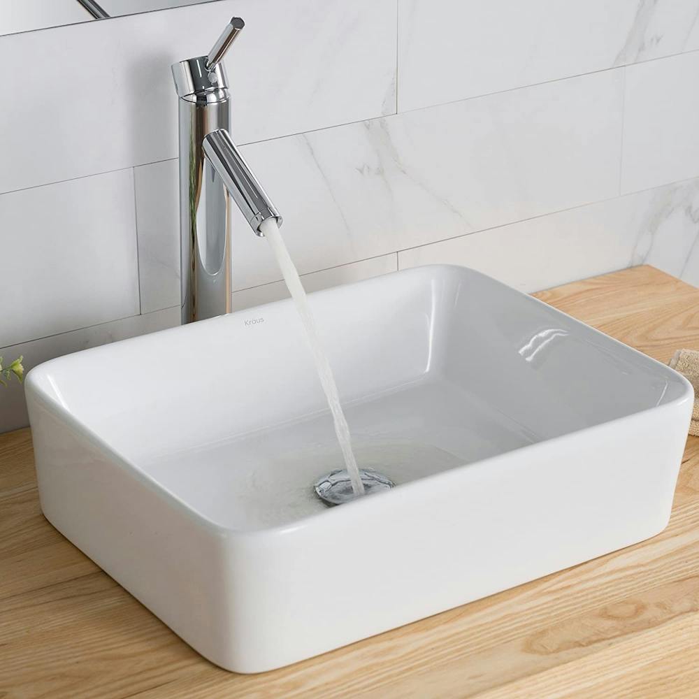
Let’s take a quick look at some good and not-so-good sink designs. First up is a good design.

This sink takes the design considerations to heart. It uses a no-nonsense square basin with generously tall sides paired with a spout that dispenses, get this, exactly in the center of the basin. Bravo. 10/10.
This next sink could use some work.

It’s a breath-taking design, no doubt, but remember! We hold functionality paramount. Say it with me, class: “form always follows function.” What needs to change? Well, that awesome-looking basin, unfortunately. As cool as it looks, it would be an absolute disaster to wash your hands in. There’s no way all the water that deflects off your hands while washing them is going to be neatly collected into those crevices. No, this sink will be plagued with a splash zone larger than a waterpark’s, and a standing water problem to boot. The faucet looks appealing, although there’s no obvious way to control flow rate or temperature. To be fair, the spout is positioned above the geometric center, which is in line with our Sink Design Manifesto. Also, this seems to be more of a concept rather than a finished product. Because of that, I will let the faucet shortcomings slide. 8/10 for effort, 2/10 for functionality, and an overall score of 3/10.
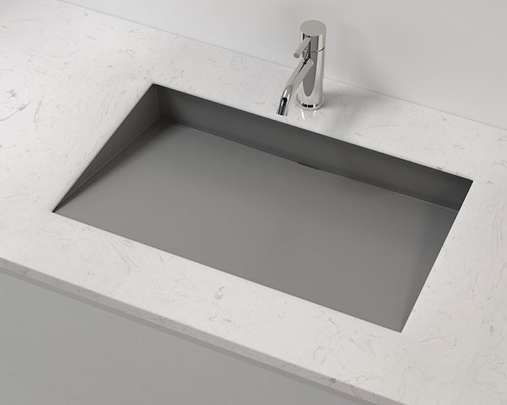
The final sink we will evaluate also has a brutally simple design. This makes it a strong contender, right?

Close, but no cigar. Initially, I really like the simple yet unique geometry and vast basin volume. This initially-great sink’s ascension to the Washroom of Fame is ultimately hampered by the slope of the basin and the chosen faucet. The basin’s maximum depth of 3.5 inches occurs against the back wall. Using simple trigonometry, that means the usable depth of the sink (i.e. the basin depth where the water is dispensed) is an unfortunate 2.5 inches. This is a recipe for an unsanitary fist-bump with the back wall. Yuck. But not all is lost! This sink could be saved if the slope of the basin is increased to provide more depth under the faucet outlet. This requires a redesign of the basin, but is likely achievable. The example faucet looks to be adequate and tastefully designed. I see no issues with it. This sink, in its current layout, seems like it would be an adequate sink with a unique stylistic twist. It has the bones for the Washroom of Fame, but comes slightly short. 6/10.
I am a strong advocate for unique design and am not saying that sinks cannot or should not be visually or physically appealing. They should be! That said, material choice and ergonomics are important. Remember, outstanding sinks always do the basics perfectly, else they can never be great sinks. Simple and understated design in the sink-world is good.
Sinks are humble, function-driven devices. Their design and existence should reflect this.
Brennan Crowder is the Multimedia Editor and sink connoisseur of The Beacon. He can be reached at crowder22@up.edu.
Have something to say about this? We’re dedicated to publishing a wide variety of viewpoints, and we’d like to hear from you.


