by Jacob Fuhrer |
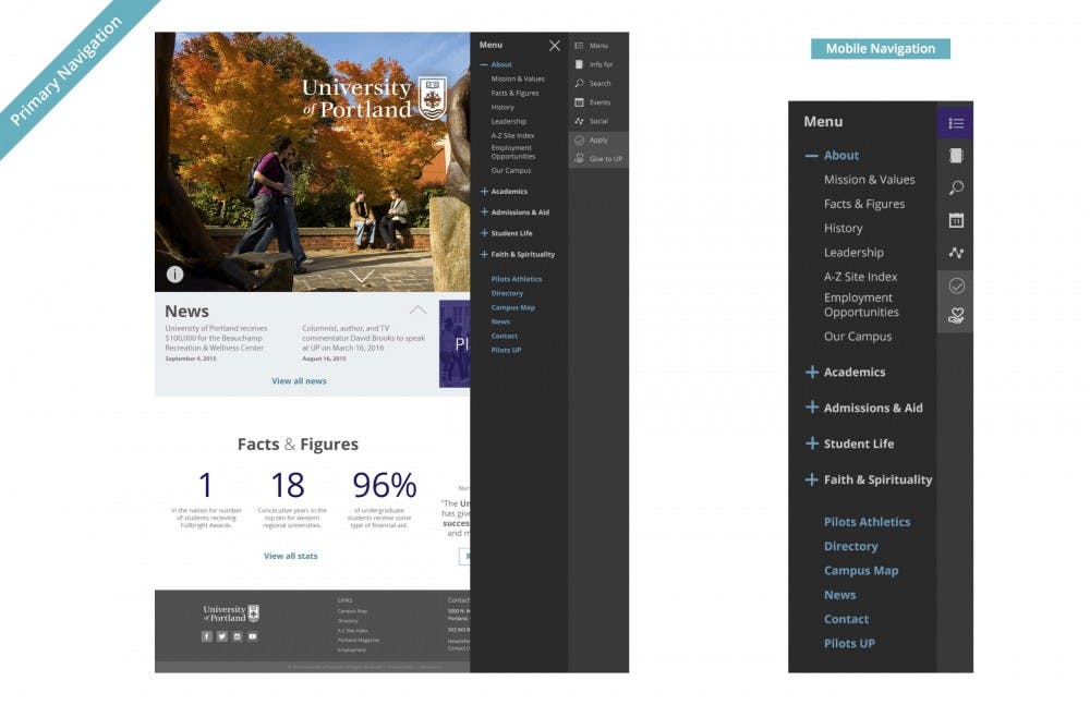
UP’s homepage is getting a much-needed face-lift this spring. The up.edu homepage will be replaced with richer media, including dynamic videos and pictures of campus as well as more personal testimonials from students.
According to Information Services, the old website is running on a decade-old content management system that is being replaced with a more advanced system, allowing for the upgrade.
In addition to looking better, the website will also function better. Users will be able to access a mobile-friendly version on phones and tablets. The toolbar will move from the top where it is now to the right-hand side for a greater ease of use, and the search functionality has been improved.
The upgrade has been in the works since 2012, and more features are expected to roll out during the summer.
Jacob Fuhrer is a reporter for The Beacon. He can be reached at fuhrer17@up.edu or on Twitter @jacobfuhrer.


