Kelsey Thomas |
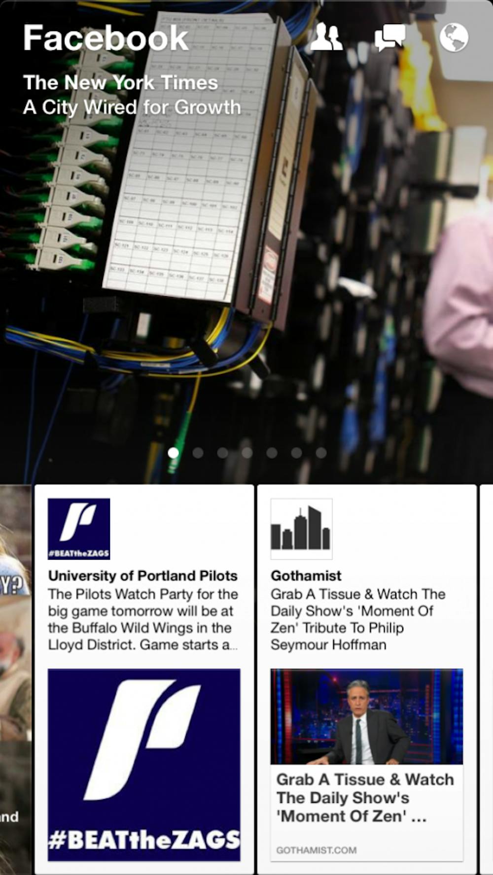
With the launch of Paper Monday, Facebook just blew its own iPhone app out of the water. But this beauty looks nothing like the clunky blue and white interface filled with updates about babies and puppies you’re used to.While Paper’s interface was initially a bit jarring because it is so different from the original Facebook app, after a day of use I can’t imagine going back. The horizontal scrolling and sliding were second nature after a few minutes, and the sleek and modern design, not to mention the Helvetica Neue UltraLight font, are a game-changer in social media mobile design.
My favorite feature is the topic-based sections that are a mix of recent and popular posts. The sections are curated for it’s users by an editorial team within Facebook, rather that the users aggregating the content for themselves. Users can choose up to 10 sections. One of these sections must be the Facebook newsfeed, but other sections include “Headlines,” with top news stories, “Cute,” with baby animals and Zooey Deschanel galore and, my personal favorite, “Flavor,” featuring food articles and blogs.
Facebook left the current app available, likely to prevent uproar over a sudden and extreme change. So if modern and innovative isn’t your thing or you don’t have an iPhone (Paper is currently iPhone only), feel free to look up that hottie from your night class on the original app.


